The New Jason Scott Montoya Logo — And Its Meaning
I've been blogging here on the site actively since January 2014 and I'd not yet built a logo for my personal brand!
Part of this delay was driven by my desire to launch before I was fully ready. If I can do things imperfectly for almost seven years, you can too!
At the beginning of 2019, I decided it was time to start exploring a brand identity. With two books done and over 400 articles published, it felt like this was a natural next step in the evolution of building an online digital platform.
So for the last 16 months, I've been tinkering with my name and a logo for it.
Here is the final result.

The colors came from my first two books (intending to convey vibrancy/diversity, movement/flow, and energy/life) and the icon came after manipulating a trinity-like graphic structure.
This recent effort to work on my logo was inspired by one of the redesigned bad logos (OGC) from this article. As I worked on the design, it morphed into the icon you see above. What's most exciting about this somewhat accidental result is the variety of interesting appropriate interpretations.
For me, the brand at its core is symbolizing my purpose, mission, and vision which is to embrace and share the source of life in unity with the community of God. It showcases the source of life and our relationship to and with it.
But, that's not all. One friend says it communicates insight, vision, listening, with a splash of technology. Another friend says it looks like me at my control center with headphones on while another says it looks like a big cradled start button. It also looks like a cartoon person, a top view of someone working, an eye, life/ideas incubating, an egg yolk, or a weird-looking Pokeball :-)
You'll start to see me experimenting with the brand in different ways and places. Eventually, I'll redesign this website to match the style. I'm also thinking of starting a comic strip with the icon to convey my message in a different short-form medium.
What do you think? And what do you see?
Thank you Jim Karwisch, Jeremy Sloan (my fellow blogging challenge buddies), and my lovely wife Cait for helping me to make this better.
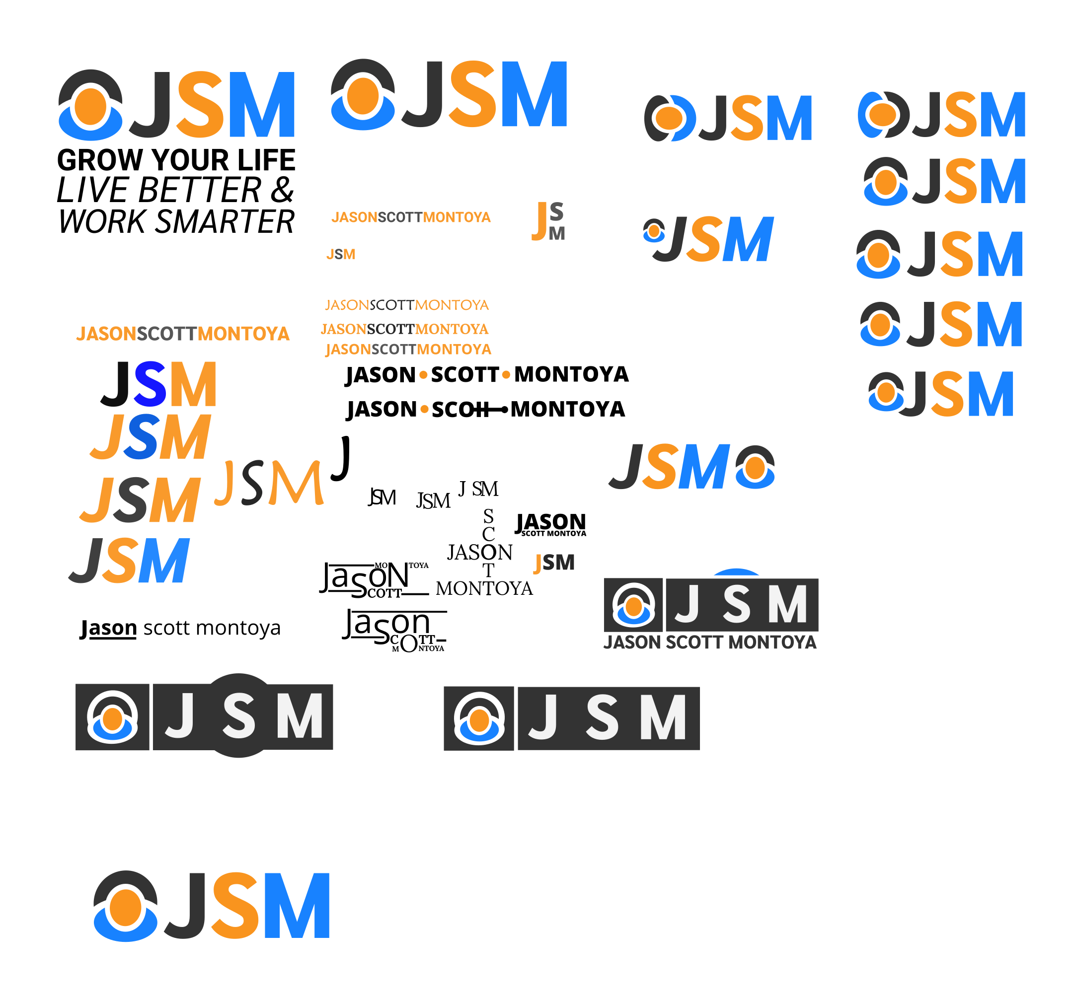
And for those of you that are curious, here is the sandbox of ideas I was toying with before I finally landed on the new design and colors.

- Created on .
- Last updated on .